
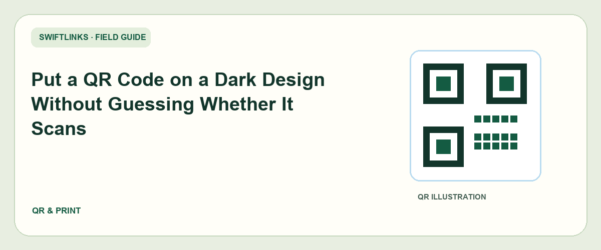
A dark poster can look excellent in a design preview and still be difficult to scan. The background, lighting, print finish, code size, and viewing distance all affect the real experience. The reliable way to judge the result is to test the finished treatment under the conditions where people will use it.
The simplest starting point is a conventional dark code on a light panel that stands apart from the design. You can keep the rest of the poster dark while giving the scanning area a clear boundary. More unusual treatments should earn their place through testing rather than through confidence in a mockup.
This guide explains how to place a QR code in a dark design, check it systematically, and maintain the destination after printing. It does not offer a universal size or color combination that works in every situation.
Keep the code area separate from the artwork
A QR code needs a clear surrounding margin. DENSO WAVE's code-area guidance specifies a quiet zone four modules wide on every side. A module is one of the small squares in the symbol, not a fixed measurement in millimeters.
Treat that margin as part of the code asset. Do not crop it away to fit a tight layout. On a dark design, a light panel can provide both the code background and the required breathing room, while the surrounding poster keeps its visual identity.
Keep nearby text, borders, textures, and illustrations outside the quiet area. A decorative line that appears harmless at full zoom may sit too close when the code is reduced for print.
If a designer supplies a transparent code image, inspect how it looks against the actual background. Transparency can make the quiet area disappear or allow a texture to show through the symbol. The final composite matters more than the file's appearance on a checkerboard preview.
An illustrative concert poster could place the code inside a plain light ticket panel at the bottom, with a separate label explaining the destination. That is a design option to test, not a claim that every ticket panel will scan reliably.
Choose the encoded address before designing
A code should lead to the intended public page. Open that destination without an administrator session before generating the asset. Confirm the event date, action, and mobile experience so you are not perfecting access to the wrong page.
If you use a short address, create it and verify it before exporting the code. Do not typeset an unconfirmed alias in the fallback text while assuming it will be available later.
Keep the encoded address in your design notes. It can be easy to lose track of which version of the code corresponds to which campaign destination, especially when several similar image files are circulating.
A QR symbol encodes data. Whether you can change the eventual destination depends on what address is encoded and whether you control a redirect behind it. Do not describe a printed code as editable merely because a design tool calls it dynamic.
For long-lived print, choose a destination you can maintain. A temporary preview, expiring download, or private registration page can fail after the poster has already been distributed.
Prefer a clear first version
Begin with an undecorated code on a plain light background. Export a high-quality asset suitable for your production workflow and preserve the original. This gives you a reference when evaluating darker or branded variations.
Place the code at the actual intended size in the poster. Do not test an enlarged version and assume the reduced artwork will behave the same way. The finished module size changes when the image is scaled.
Check the code's edges after export. Blurring, aggressive image compression, and repeated resizing can alter a sharp asset. If the production system supports a suitable vector format, confirm that it survives the designer's and printer's workflow correctly.
Avoid arbitrary gradients or decorative textures inside the code. If you want to try them, make a separate variant and compare it with the plain reference. Keep the working reference available until the final design passes the agreed tests.
The aim is not to remove creativity from the poster. It is to isolate the part that performs the scanning task so the rest of the design can remain expressive without compromising access.
Test a printed proof, not only a screen
A screen and a printed surface behave differently. A backlit display can make contrast look stronger, while gloss, ink spread, folds, and ambient light affect printed output. Request or produce a proof using the intended materials where practical.
Print the code at the real size. Hold or mount the proof as it will be encountered. If the finished poster sits on a wall, place the test at a comparable height rather than scanning it flat on a desk.
Start at a realistic distance. A person walking past should not have to press a phone against a public poster unless that interaction is intentional and clearly supported by the setting.
Use more than one phone where available. Include an older or ordinary device rather than testing only with the newest camera. Record the devices and conditions so the result can be interpreted honestly.
A successful scan means the correct destination opens, not merely that a phone recognizes some data. Confirm the landing page and try the promised action. A code that opens a private draft has passed only a small part of the test.
Build a small test matrix
Choose conditions based on the placement. A restaurant menu insert may need testing under warm low light. A foyer poster may face reflections from overhead lights. Outdoor material may be viewed in bright daylight or at an angle.
For each relevant condition, record whether recognition is immediate, delayed, or unsuccessful, and whether the intended page opens. You do not need invented numerical scores. A clear observation is more useful than a percentage based on a handful of informal attempts.
Vary one design factor at a time when investigating a failure. Compare a larger code with the original size, or a plain panel with a textured one. If you change size, colors, margin, and finish together, you may fix the issue without understanding which choice mattered.
Mark the test version on the proof sheet. Similar posters can have different code assets, and an undocumented pass can be mistakenly assigned to a later untested revision.
If your intended audience cannot reasonably perform the scan in the location, redesign the interaction. A technically scannable code placed behind a barrier or at an unsafe stopping point still creates a poor experience.
Handle inverted and colored treatments cautiously
A light code on a dark background may work with some readers, but do not assume it behaves like a conventional dark-on-light symbol across all devices and conditions. Treat inversion as a separate variant that needs its own evaluation.
A dark blue or another brand color can look readable to a person while performing differently after printing. Compare the actual proof rather than relying on the color values in a design file.
The background should be uniform within the scanning area. A gradient that becomes brighter near one edge can change the apparent contrast across the symbol. A photo behind the code introduces even more variation.
If the branded version fails where the plain version succeeds, keep the plain code treatment and apply the brand around it. A label, frame outside the quiet area, or nearby logo can carry identity without altering the symbol itself.
Do not claim a color treatment is safe because it worked once on your own phone. The relevant question is whether it works sufficiently well across the test conditions you selected for the actual placement.
Label the next step
A person deciding whether to scan should know what the code opens. “See tonight's programme” is clearer than a bare code or a vague instruction to scan. The label can be outside the quiet area while remaining visually associated with the code.
Mention any important condition, such as a booking requirement or a download, where it helps set expectations. Do not hide a sign-in demand behind a promise of immediate public information.
Include a readable fallback address where practical. A person without a suitable camera, battery, or network access may need another route. The fallback should reach the same useful destination, not a generic homepage that requires searching again.
Check the fallback at the real print size too. A tiny address included only to satisfy a checklist is not much help. Choose a typeface and contrast that work on the dark design.
For a short link, verify the fallback spelling and the QR destination together. A mismatched typed route creates a frustrating experience for people who choose the alternative.
Troubleshoot the failure layer
If the phone cannot recognize the code, inspect the symbol and production treatment. Size, margin, contrast, blur, angle, reflection, and damage are relevant. Compare with the original undecorated asset to narrow the cause.
If the phone recognizes the code but the page fails, inspect the encoded address and web destination. The issue may involve connectivity, a disabled route, permissions, or an unavailable page. Increasing the printed code size will not fix a private file.
If the page opens but people cannot complete the action, test the landing page on mobile. A cramped form, unclear button, or expired event is a destination issue. The campaign needs a usable journey, not merely a successful scan.
If recognition becomes unreliable after printing, compare the proof with the design. Look for accidental scaling, a changed background, a missing margin, or surface reflections. Share the exact failing sample with the printer rather than sending only the original file.
If a late edit changes the code, rerun the relevant tests. A previously approved poster is not proof that a different symbol or resized layout remains approved.
Approve and archive the final artwork
Before releasing the print run, record the final asset filename, encoded destination, print dimensions, material, and test conditions. Keep a copy of the approved proof or production PDF according to your team's workflow.
Assign one person to confirm that the code in the final file matches the tested code. This is especially valuable when a designer exports several versions and the printer receives a file through a separate contact.
For an illustrative venue campaign, the approval note might say that the booking route was tested from the printed proof in the foyer and that the plain panel variant was selected. It should not invent scan rates or customer outcomes.
After the first batch arrives, inspect an actual finished item. A proof and a production run can differ. Test a representative copy before distributing everything if your schedule and quantity allow it.
Keep the destination owner in the campaign record. The printer can preserve the code image perfectly while the website owner later moves the page. Both parts need an accountable maintainer.
Frequently asked questions
Is there one minimum QR size for dark posters?
There is no universal measurement that fits every data payload, print method, viewing distance, and device. Start with a practical layout, preserve the required margin, and test the actual output. If scanning is difficult, increase the area or simplify the treatment rather than defending the original mockup.
Can I place a border around the light panel?
Keep any border outside the quiet area and test the complete design. A border can help organize the poster visually, but it should not crowd the symbol or become part of its background.
Does a higher error-correction setting replace testing?
No. Error correction helps with certain forms of damage, but it is not permission to ignore contrast, margin, or the production process. A design still needs to be evaluated as a finished asset in its intended setting.
What if the dark treatment never scans consistently?
Use the plain reference version in a clear light panel. Preserve the dark theme elsewhere. The code is a functional access point, and a reliable route is more useful than an elaborate treatment that makes visitors retry.
How often should the destination be checked?
Check it before printing, after production, and during the period the material remains in use. Review again after website moves or account changes. Long-lived print deserves a maintained destination because the physical code cannot update its own promise.
A final design review with the whole journey in mind
Ask a person unfamiliar with the campaign to look at the poster. Can they identify what scanning will do? Can they see the alternative address? Can they stand safely in a position where scanning works? Their experience can reveal problems that a close-up designer's view misses.
Then follow the route to completion. Open the page, find the promised information, and perform the intended action in a test-safe way. Avoid creating real bookings or payments merely to prove that the code opens a form; use the destination's approved testing process.
A dark design succeeds when the visual identity and the access task work together. The light panel, clear label, realistic proof, and maintained destination are all part of that result. Treat them as deliberate design decisions rather than concessions added after a scan failure.