
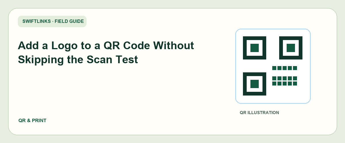
Adding a logo to a QR code is a branding choice that changes a functional symbol. It can make the code look connected to your business, but it can also hide information the reader needs to decode. A polished image is therefore only the start of the approval process.
The dependable approach is to keep an unmodified reference code, make a restrained branded version, and compare both in the final production conditions. If the branded version is unreliable, move the logo beside the code rather than sacrificing the access task.
This guide explains how to review a logo treatment without assuming a universal safe logo size. The examples are illustrative design workflows, not measured scan-rate claims or guarantees about particular phones.
Know what the logo changes
A QR symbol carries encoded data through its arrangement of modules. Covering part of that arrangement with a logo removes visible information. Error correction can recover some damage, but the outcome depends on the symbol and the changes made to it.
DENSO WAVE's error-correction explanation describes recovery from dirty or damaged codes. That capability should not be translated into a universal percentage of the image that you can safely cover with branding. Placement and the actual encoded symbol matter.
Do not treat a logo option in a generator as automatic approval for every layout. The generator cannot know the final print size, paper finish, viewing angle, lighting, or audience devices unless those are part of a real testing process.
The logo also changes how people interpret the code. Readers may infer that the route belongs to the displayed brand. Use only branding you have permission to use, and make the destination consistent with that expectation.
A branded code should simplify recognition, not hide a surprising destination. The nearby label and landing page should explain the same task the surrounding campaign promises.
Start with a confirmed destination
Create the actual route before designing the logo treatment. Open it in a public browser session and check the intended page. A beautiful code pointing to a draft or expired offer is still a failed campaign asset.
Record the exact address encoded in the symbol. If you generate several variants, confirm they all encode the same destination before comparing their scan behavior. Otherwise, a failure might be a route problem rather than a visual problem.
If you use a managed short route, verify who can edit it and whether the service supports the changes you expect. Do not assume that a printed QR code can be redirected later without a controlled address behind it.
For an illustrative café promotion, the code might lead to a public seasonal menu page. The printed label should describe that page. A sign-in-only staff menu or a temporary design preview is not an appropriate substitute.
Test the destination on a phone before spending time on the code. The symbol is only the entry point; the page needs to deliver the promised information after recognition succeeds.
Preserve an unmodified reference version
Export a plain code with its surrounding margin and keep it in the project folder. Name it clearly as the reference. It becomes the baseline for investigating a branded version that scans inconsistently.
Also keep the original generator settings and destination in your notes. If you need to recreate the asset, you should know what was encoded and which settings were used rather than guessing from a screenshot.
Use separate filenames for the branded versions. A folder containing reference, small-logo, and beside-logo variants is easier to review than several unrelated files all called qr-final.
Avoid repeatedly editing a compressed image. Each export can introduce changes to edges or clarity. Use the production format appropriate to your design and print workflow, and check that the final output preserves the intended symbol.
Do not discard the plain version after one successful branded test. It remains a useful fallback if the printer, placement, or campaign size changes later.
Make the first branded version restrained
Begin with a modest treatment rather than the largest logo the design tool allows. Keep the symbol's important structural patterns untouched. If you do not know how a proposed overlay affects the code, use a generator's supported workflow and still verify the output.
Give the logo a simple shape and a clear boundary. A detailed mark with many tiny elements can look messy at the size used inside a code. Simplifying the mark for small display may be appropriate, provided it remains an approved brand asset.
Do not add several simultaneous decorations. Rounded modules, color gradients, a central logo, and a textured background make it difficult to identify which change caused a failure. Test a restrained first version before adding complexity.
Keep the required surrounding quiet area. Branding inside the code does not justify cropping its outer margin. DENSO WAVE's code-area guidance identifies a four-module margin around a standard QR symbol.
Consider an alternative with the logo beside the code. It may provide the same brand recognition while leaving the symbol intact. Include that version in the review instead of assuming the logo must be embedded.
Evaluate size in the actual layout
A branded QR image may look sharp when enlarged on a monitor. The printed card or label can be much smaller. Place the asset at its intended dimensions before deciding whether the logo and modules remain clear.
Check the surrounding content too. A code squeezed between text and a fold can become awkward to scan even if the symbol itself is correct. The whole layout determines how people hold and approach it.
If the asset will appear on several formats, test each important size separately. A version approved for a poster is not automatically approved for a business card or bottle label.
For an illustrative product launch, a designer might use the same destination on a large display and a small insert. Keeping the destination identical does not make the visual conditions identical. The insert needs its own proof and scan review.
Record the dimensions of the approved version. “The logo code works” is too vague when the same file can later be scaled down to fit a new layout.
Test a proof under likely conditions
Produce a proof with the intended background and print finish where practical. Test it on a normal phone, then another available device. Use the location's likely lighting and viewing angle instead of holding the image close under ideal desk lighting.
Compare the plain reference and branded version in the same conditions. If the plain version works consistently while the branded one causes repeated attempts, the decoration deserves review.
Observe the experience without inventing precision. Record “recognized on first attempt,” “needed repositioning,” or “not recognized in this condition,” along with the device and proof version. Informal testing does not justify claiming a universal success rate.
Confirm that every recognized code opens the intended page. A camera can read a symbol perfectly while the destination has moved or become private. Keep visual recognition and destination access as separate test results.
If the code will be placed on a curved or reflective surface, test that surface. A flat paper proof cannot fully represent a glossy bottle, a laminated badge, or packaging with a fold through the code area.
Use controlled revisions when a test fails
Change one factor at a time. Try a smaller overlay, a larger code area, a simpler background, or the beside-logo version. Keep the destination and test conditions stable while comparing the design change.
Save each candidate with a clear version label. Otherwise, the team may approve one proof and accidentally print another. A note such as small-logo-v3 is useful only when the file and production export use the same identifier.
Do not increase error correction and assume the problem is solved. The revised symbol may differ in density or size, and the finished treatment still needs testing. The setting is one part of the design process rather than a substitute for it.
If several revisions remain unreliable, choose the unmodified code. A functioning route with a nearby logo is better than an embedded mark that makes people hesitate or give up.
Document why the final version was selected. This helps a future designer understand that the plain treatment was a tested decision, not an oversight they should casually embellish.
Check the message around the code
Branding explains who is presenting the route. A label explains what the route does. Both are useful, and the logo does not replace a meaningful instruction.
Use a task-specific label such as “View the current menu” or “Read the installation guide.” Avoid vague copy that asks people to scan without giving a reason. Readers should not need to trust an unexplained symbol simply because it contains a familiar mark.
Include a readable fallback address when practical. It helps people who cannot scan and gives everyone another way to recognize the route. Check that it opens the same destination as the symbol.
Keep the fallback outside the quiet area and large enough for the format. A tiny line of text included only as decoration is not a usable alternative.
If the destination requires an account or downloads a substantial file, set that expectation nearby when appropriate. A clear promise reduces confusion after a successful scan.
Approve the production file deliberately
Before printing, compare the code in the final production file with the tested asset. Check the destination, size, logo overlay, surrounding margin, and background. Export settings or late layout changes can alter an approved design.
Assign an owner for final sign-off. The designer, marketer, and printer may each assume another person has verified the code. One named reviewer should confirm that the public route and the production proof match.
Keep the approval record with the design files. Include the proof version, test conditions, date, and person responsible for destination maintenance. You do not need an elaborate report, but you need enough information to repeat the decision.
When the first finished items arrive, scan a representative copy. A production run can differ from a digital proof or a sample printed on another device. Catching a mismatch before distribution is much easier than recovering printed material later.
If the code will be used indefinitely, add a destination review date. An unchanged image can begin failing for readers because the web page changed, even when the print remains perfect.
Troubleshooting branded codes
The plain code scans but the logo version does not
Reduce or remove the overlay and compare again. Inspect whether other styling changed at the same time. Keep the plain code as the control so you can isolate the effect of branding rather than changing the whole design at once.
Both versions fail after printing
Review production size, sharpness, surrounding margin, background, finish, and encoded destination. If cameras do not recognize either symbol, focus on the physical asset. If recognition works but loading fails, investigate the route and page instead.
It works on one phone only
Expand the test conditions and use the more conservative design. A code intended for a broad audience should not depend on one particular camera's tolerance. Record the limitation rather than declaring the successful device representative of everyone.
The code was approved before a last-minute resize
Treat the resized version as a new production condition. Rerun the relevant checks at the finished dimensions. A layout change can affect the functional part even when nobody intentionally edited the QR image.
People scan but cannot find the offer
Inspect the landing page and campaign wording. The code may be working perfectly while the page gives too many choices or shows an outdated promotion. Correct the destination experience instead of redesigning the symbol without evidence.
Frequently asked questions
Is there a universal safe logo percentage?
Do not rely on one. The encoded symbol, overlay position, production quality, and viewing conditions all matter. Use a restrained design and test the actual output rather than treating an internet rule of thumb as a guarantee.
Must a business logo be inside the code?
No. A nearby logo, clear label, and consistent landing page can establish the relationship without covering modules. Compare the beside-logo design as a serious candidate, especially for small print.
Can I reuse the same branded asset everywhere?
You can reuse a destination, but each important placement can introduce different dimensions and conditions. Verify the asset where it will be used. A large reception sign and a small package insert are different scanning tasks.
What should the design handoff include?
Provide the encoded address, plain reference, approved branded variant, dimensions, production proof, test notes, fallback address, and destination owner. This information prevents a future designer from accidentally replacing a tested version with an attractive but unverified one.
Keep branding accountable to the task
A QR code is useful when people can recognize it, understand the promise, scan or use an alternative route, and complete the intended action. The logo should support that journey rather than compete with it.
For Swiftlinks campaigns, maintain the saved destination and public route alongside the artwork. Branding can change during a redesign, while printed addresses continue circulating. Keeping those records connected lets you improve the design without losing the functional history.
The strongest approval is a real proof opening the right page in realistic conditions. Keep that standard even when the branded image looks convincing at first glance. A small amount of disciplined testing can prevent a large amount of avoidable reprinting and reader frustration.